> ## Documentation Index
> Fetch the complete documentation index at: https://docs.neynar.com/llms.txt
> Use this file to discover all available pages before exploring further.
# Customize SIWN - Neynar API
> Comprehensive guide to customizing Sign In With Neynar (SIWN) for seamless Farcaster authentication. Learn to customize the sign-in experience, integrate write access permissions, and connect user accounts to your app in minutes with custom styling and branding.
### Sign In with Neynar (SIWN) is the easiest way to let users connect their Farcaster account to your app
See [SIWN: Connect Farcaster Accounts](/docs/how-to-let-users-connect-farcaster-accounts-with-write-access-for-free-using-sign-in-with-neynar-siwn) on how to integrate in less than a min.
This guide shows you how to customize the sign in experience for your users. The SIWN button on your app can be customized as you see fit. Below is how it shows up by default:
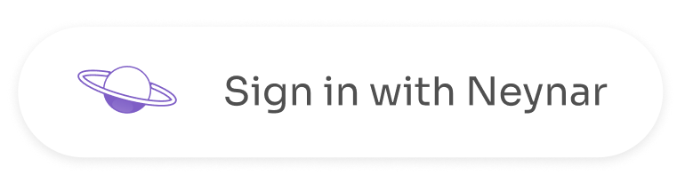 Check [demo.neynar.com](https://demo.neynar.com) to try out live customizations. Below are some of the attributes you can change in the code when integrating:
**data-variant** :
* Values: `neynar`, `warpcast`, `farcaster`
* defaultValue: `neynar`
* dataType: *string*
**data-theme** : Theme of button
* Values: `light` (#ffffff) \[default] , `dark` (#000000)
* defaultValue: `light`
* Applicable for **data-variant. Not** for Custom Text + Logo (**data-text** and **data-custom\_logo\_url**)
* **data-background\_color** can override the colour **data-theme** color
* dataType: *string*
**data-logo\_size** : Logo size for **data-variant**
* defaultValue: `30px`
* dataType: string (Takes values similar to a css property eg. 40px or 40 or 4rem)
* Applicable for **data-variant. Not** for **data-custom\_logo\_url**
**data-height** :
* defaultValue: `48px`
* dataType: *string* (Takes values similar to a css property eg. 40px or 40 or 4rem)
* Applicable for **data-variant** and Custom Text + Logo (**data-text** and **data-custom\_logo\_url**)
**data-width** :
* defaultValue: `218px` (By default minWidth is set to `205px` but it can be modified using **data-styles**)
* dataType: *string* (Takes values similar to a css property eg. 40px or 40 or 4rem)
* Applicable for **data-variant** and Custom Text + Logo (**data-text** and **data-custom\_logo\_url**)
**data-border\_radius** :
* defaultValue: `10px`
* dataType: *string* (Takes values similar to a css property eg. 40px or 40 or 4rem or ‘10px 20px 30px 40px’)
* Applicable for **data-variant** and Custom Text + Logo (**data-text** and **data-custom\_logo\_url**)
**data-font\_size** :
* defaultValue: `16px`
* dataType: *string* (Takes values similar to a css property eg. 40px or 40 or 4rem)
* Applicable for **data-variant** and Custom Text + Logo (**data-text** and **data-custom\_logo\_url**)
**data-font\_weight** :
* defaultValue: `300`
* dataType: *string* (Takes values similar to a css property eg. 100 or normal)
* Applicable for **data-variant** and Custom Text + Logo (**data-text** and **data-custom\_logo\_url**)
**data-padding** :
* defaultValue: ‘`8px` `15px`’
* dataType: *string* (Takes values similar to a css property eg. 40px or 40 or 4rem or ‘10px 20px 30px 40px’)
* Applicable for **data-variant** and Custom Text + Logo (**data-text** and **data-custom\_logo\_url**)
**data-margin** :
* defaultValue: `0px`
* dataType: *string* (Takes values similar to a css property eg. 40px or 40 or 4rem or ‘10px 20px 30px 40px’)
* Applicable for **data-variant** and Custom Text + Logo (**data-text** and **data-custom\_logo\_url**)
**data-text** :
* defaultValue: `“”`
* dataType: *string*
* Applicable for Custom Text + Logo (**data-text** and **data-custom\_logo\_url**)
* For this **data-variant** should **not** be present
**data-color** :
* defaultValue: `#000000`
* dataType: *string* (Takes values similar to a css property eg. red or #e2e2e2)
* Applicable for **data-variant** and Custom Text + Logo (**data-text** and **data-custom\_logo\_url**)
**data-background\_color** :
* defaultValue: `#ffffff`
* dataType: *string* (Takes values similar to a css property eg. red or #e2e2e2)
* Applicable for **data-variant** and Custom Text + Logo (**data-text** and **data-custom\_logo\_url**)
**data-styles** :
* defaultValue: `“”`
* dataType: string
* Applicable for **data-variant** and Custom Text + Logo (**data-text** and **data-custom\_logo\_url**)
* **overrides all the above styles**
* example: data-styles='\{ "backgroundColor": "red" }'
**data-custom\_logo\_url** : Hosted logo (**preferably** svg)
* defaultValue: `“”`
* dataType: *string*
* Applicable for Custom Text + Logo (**data-text** and **data-custom\_logo\_url**)
* **Note:** size of the logo should be adjusted within svg itself
Check [demo.neynar.com](https://demo.neynar.com) to try out live customizations. Below are some of the attributes you can change in the code when integrating:
**data-variant** :
* Values: `neynar`, `warpcast`, `farcaster`
* defaultValue: `neynar`
* dataType: *string*
**data-theme** : Theme of button
* Values: `light` (#ffffff) \[default] , `dark` (#000000)
* defaultValue: `light`
* Applicable for **data-variant. Not** for Custom Text + Logo (**data-text** and **data-custom\_logo\_url**)
* **data-background\_color** can override the colour **data-theme** color
* dataType: *string*
**data-logo\_size** : Logo size for **data-variant**
* defaultValue: `30px`
* dataType: string (Takes values similar to a css property eg. 40px or 40 or 4rem)
* Applicable for **data-variant. Not** for **data-custom\_logo\_url**
**data-height** :
* defaultValue: `48px`
* dataType: *string* (Takes values similar to a css property eg. 40px or 40 or 4rem)
* Applicable for **data-variant** and Custom Text + Logo (**data-text** and **data-custom\_logo\_url**)
**data-width** :
* defaultValue: `218px` (By default minWidth is set to `205px` but it can be modified using **data-styles**)
* dataType: *string* (Takes values similar to a css property eg. 40px or 40 or 4rem)
* Applicable for **data-variant** and Custom Text + Logo (**data-text** and **data-custom\_logo\_url**)
**data-border\_radius** :
* defaultValue: `10px`
* dataType: *string* (Takes values similar to a css property eg. 40px or 40 or 4rem or ‘10px 20px 30px 40px’)
* Applicable for **data-variant** and Custom Text + Logo (**data-text** and **data-custom\_logo\_url**)
**data-font\_size** :
* defaultValue: `16px`
* dataType: *string* (Takes values similar to a css property eg. 40px or 40 or 4rem)
* Applicable for **data-variant** and Custom Text + Logo (**data-text** and **data-custom\_logo\_url**)
**data-font\_weight** :
* defaultValue: `300`
* dataType: *string* (Takes values similar to a css property eg. 100 or normal)
* Applicable for **data-variant** and Custom Text + Logo (**data-text** and **data-custom\_logo\_url**)
**data-padding** :
* defaultValue: ‘`8px` `15px`’
* dataType: *string* (Takes values similar to a css property eg. 40px or 40 or 4rem or ‘10px 20px 30px 40px’)
* Applicable for **data-variant** and Custom Text + Logo (**data-text** and **data-custom\_logo\_url**)
**data-margin** :
* defaultValue: `0px`
* dataType: *string* (Takes values similar to a css property eg. 40px or 40 or 4rem or ‘10px 20px 30px 40px’)
* Applicable for **data-variant** and Custom Text + Logo (**data-text** and **data-custom\_logo\_url**)
**data-text** :
* defaultValue: `“”`
* dataType: *string*
* Applicable for Custom Text + Logo (**data-text** and **data-custom\_logo\_url**)
* For this **data-variant** should **not** be present
**data-color** :
* defaultValue: `#000000`
* dataType: *string* (Takes values similar to a css property eg. red or #e2e2e2)
* Applicable for **data-variant** and Custom Text + Logo (**data-text** and **data-custom\_logo\_url**)
**data-background\_color** :
* defaultValue: `#ffffff`
* dataType: *string* (Takes values similar to a css property eg. red or #e2e2e2)
* Applicable for **data-variant** and Custom Text + Logo (**data-text** and **data-custom\_logo\_url**)
**data-styles** :
* defaultValue: `“”`
* dataType: string
* Applicable for **data-variant** and Custom Text + Logo (**data-text** and **data-custom\_logo\_url**)
* **overrides all the above styles**
* example: data-styles='\{ "backgroundColor": "red" }'
**data-custom\_logo\_url** : Hosted logo (**preferably** svg)
* defaultValue: `“”`
* dataType: *string*
* Applicable for Custom Text + Logo (**data-text** and **data-custom\_logo\_url**)
* **Note:** size of the logo should be adjusted within svg itself