Sign In with Neynar (SIWN) is the easiest way to let users connect their Farcaster account to your app
See SIWN: Connect Farcaster Accounts on how to integrate in less than a min.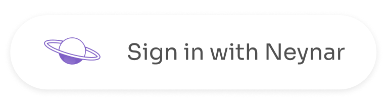
- Values:
neynar,warpcast,farcaster - defaultValue:
neynar - dataType: string
- Values:
light(#ffffff) [default] ,dark(#000000) - defaultValue:
light - Applicable for data-variant. Not for Custom Text + Logo (data-text and data-custom_logo_url)
- data-background_color can override the colour data-theme color
- dataType: string
- defaultValue:
30px - dataType: string (Takes values similar to a css property eg. 40px or 40 or 4rem)
- Applicable for data-variant. Not for data-custom_logo_url
- defaultValue:
48px - dataType: string (Takes values similar to a css property eg. 40px or 40 or 4rem)
- Applicable for data-variant and Custom Text + Logo (data-text and data-custom_logo_url)
- defaultValue:
218px(By default minWidth is set to205pxbut it can be modified using data-styles) - dataType: string (Takes values similar to a css property eg. 40px or 40 or 4rem)
- Applicable for data-variant and Custom Text + Logo (data-text and data-custom_logo_url)
- defaultValue:
10px - dataType: string (Takes values similar to a css property eg. 40px or 40 or 4rem or ‘10px 20px 30px 40px’)
- Applicable for data-variant and Custom Text + Logo (data-text and data-custom_logo_url)
- defaultValue:
16px - dataType: string (Takes values similar to a css property eg. 40px or 40 or 4rem)
- Applicable for data-variant and Custom Text + Logo (data-text and data-custom_logo_url)
- defaultValue:
300 - dataType: string (Takes values similar to a css property eg. 100 or normal)
- Applicable for data-variant and Custom Text + Logo (data-text and data-custom_logo_url)
- defaultValue: ‘
8px15px’ - dataType: string (Takes values similar to a css property eg. 40px or 40 or 4rem or ‘10px 20px 30px 40px’)
- Applicable for data-variant and Custom Text + Logo (data-text and data-custom_logo_url)
- defaultValue:
0px - dataType: string (Takes values similar to a css property eg. 40px or 40 or 4rem or ‘10px 20px 30px 40px’)
- Applicable for data-variant and Custom Text + Logo (data-text and data-custom_logo_url)
- defaultValue:
“” - dataType: string
- Applicable for Custom Text + Logo (data-text and data-custom_logo_url)
- For this data-variant should not be present
- defaultValue:
#000000 - dataType: string (Takes values similar to a css property eg. red or #e2e2e2)
- Applicable for data-variant and Custom Text + Logo (data-text and data-custom_logo_url)
- defaultValue:
#ffffff - dataType: string (Takes values similar to a css property eg. red or #e2e2e2)
- Applicable for data-variant and Custom Text + Logo (data-text and data-custom_logo_url)
- defaultValue:
“” - dataType: string
- Applicable for data-variant and Custom Text + Logo (data-text and data-custom_logo_url)
- overrides all the above styles
- example: data-styles=’{ “backgroundColor”: “red” }’
- defaultValue:
“” - dataType: string
- Applicable for Custom Text + Logo (data-text and data-custom_logo_url)
- Note: size of the logo should be adjusted within svg itself